How to build dynamic charts from lead's answers
Who doesn't love charts? They are a universal language to present information in a graphical way to your customers. It will help you get emphasis on the important info and display it to your customers.
With the power of our custom fields, we can create charts on the fly and represent it to your leads in the conversation.
In this article we will cover :
Introduction
Currently, to generate charts on the fly we need to use a service that will create the charts and return it to us, in this tutorial we will use Quickcharts.io. Quickcharts has a lot of charts types that you can pick any of them in their charts gallery. You will be editing the chart's JSON data to generate that chart, we will pick a simple bar chart in the coming example, after that we will add Continually leads in the generated URL and add it as an image that your leads can view in the conversation.
Note: To create more complex charts, it is advised to use our External API object to send the request and save the chart's URL in a custom field and show it to the visitors.
How to build a bar chart
1. Build your bot and create the required values that will be used to generate the chart, we used an open question to ask the visitors for their sales in January, Febrauary and March. and saved their answers in custom fields sales_january, sales_february and sales_march.

2. Go to Quickcharts Gallery and pick the bar chart that you want to use. We will use the Vertical bar chart.
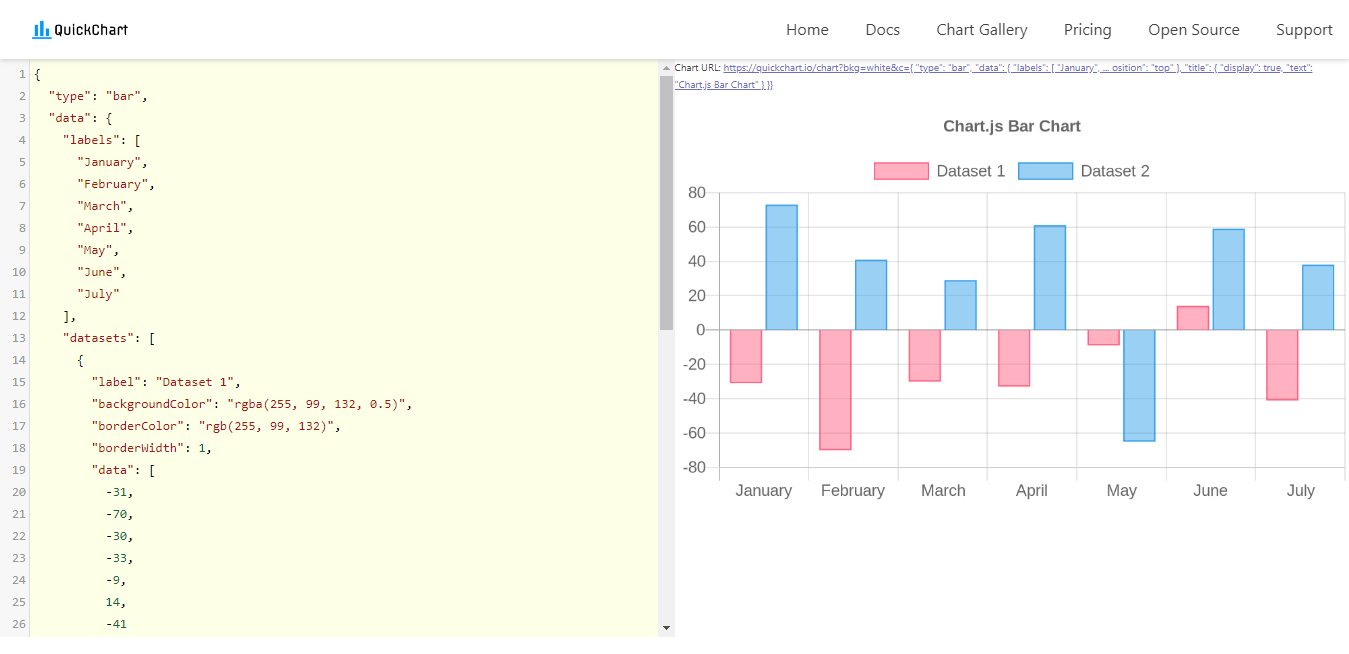
3. Start removing the unnecessary part of the chart and customizing the JSON code to the left, we will just keep one dataset and change the chart's title and color. To know the RGB color value, use this Color Picker.

4. For our example, we will just keep the first three months and remove the rest. We will also start changing the values to test everything is working correctly.

5. After we are sure everything is set correctly, we need to start inserting the Continually custom fields into that link so we can create the chart dynamically. This link will be encoded automatically and have all of the symbols encoded. Simply, write the name of each custom field then copy the link to any text editing software and wrap each custom field name with a curly bracket and @ symbol. Like this {@sales_january}

6. Copy that link and add it as an image object in the bot.

7. Now let's test it in real-time :

This same logic can be applied to any type of chart that you want to create. Build and adjust the bar then add the custom fields then add the link to Continually as an image and the chart will be auto created.